Debbie Harpham

by Carol Van Den Hende
Have you ever wondered whether people “judge books by their cover”? Of course, a book’s content is critically important, yet humans are wired to be visual beings!
“More than 50 percent of the cortex, the surface of the brain, is devoted to processing visual information,” points out David Williams, the William G. Allyn Professor of Medical Optics1.
We infer all types of information from the visual cues on a book cover, like genre, tone, whether there’s an intended target audience, a central tension or question, or something about the characters and topic.
I’ve worked in brand marketing, including the use of graphics and design, for 20+ years, so these topics particularly intrigue me.
While I can’t speak for all book cover designers, I especially like the response that the Creative Director of Little, Brown and Company gave about his creative process. In a Shutterstock article, Mario Pulice said:
“I will only read the book to the point where I have ideas, and then I’ll stop reading it because if we read the whole thing and start analyzing it, we might give too much away…I’d rather be more evocative of the book than give it all away on the front cover.” 2
Readers often wonder what it’s like to work with a publisher on book cover design. Let me share my experience. I really enjoyed working with Koehler Book’s designers to craft a cover for my novel, Goodbye, Orchid.
First, I briefed the design team that the cover should represent the physical and emotional shattering of my characters, Phoenix and Orchid. I provided reference cover designs, the central tension of the book, and my suggestions on tonality. From there, they explored several routes, and ultimately hosted a public vote between the top two candidates (how fun!) See the winning design below.
I’m fortunate that Koehler Books was receptive to collaborating with me on designs, and am proud that Goodbye, Orchid has won three design awards, including the 2020 Royal Dragonfly award for Cover Design and 2021 American Advertising Award Hampton Roads branch Book Cover Gold Medal Addy, in addition to more than a dozen other literary awards.
By using the shattered orchids and Goodbye, Orchid script font consistently, these visuals have become associated with this “modern, important take on the power of love”:

I joined Novel Network as an author in 2021, and was struck by the impressive portfolio of writers and titles. In addition to the quality of the writing, I enjoyed scrolling through pages of beautiful covers.
As with other types of design, book cover trends change over time. Here are a few themes I noticed. Of course, as with all art, design is subjective, and these covers could be grouped together in myriad ways. Take a look and see which of these resonate with you:
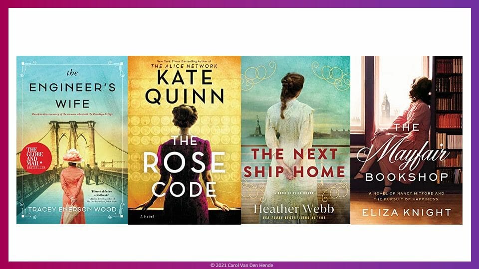
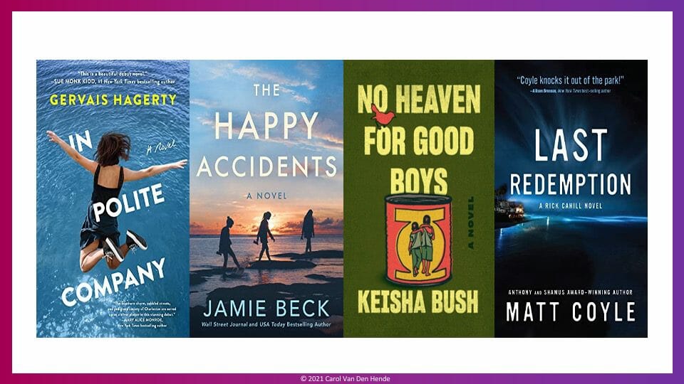
- Obscuring the features of the protagonist. Characters depicted on book covers are often turned away or otherwise have their features obscured. This can be useful to include a person in the design while still allowing a reader to imagine what they precisely look like. This technique can create a feeling of intrigue.
Here are some examples of characters with their backs turned to the viewer:
This can also be achieved by showing the protagonist in profile:
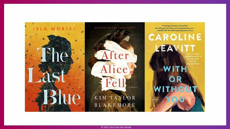
Another approach is to obscure the features via silhouette or shadows:
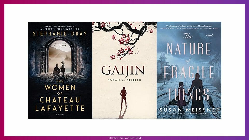
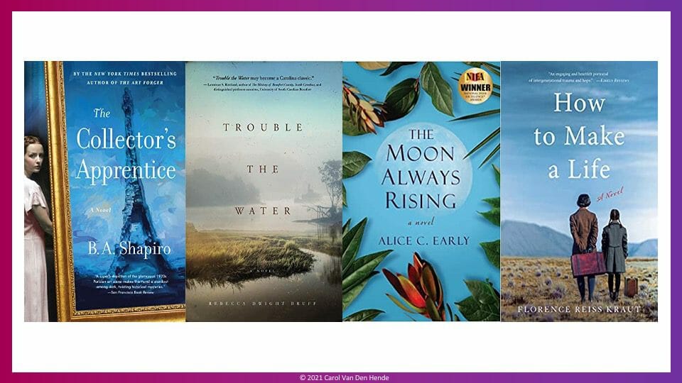
2. Realistic images or photography. Realistic visuals can create a more concrete, grounded feeling. This can be useful in non-fiction, to paint a crisp image, or to reference an actual place. Here are some Novel Network examples:
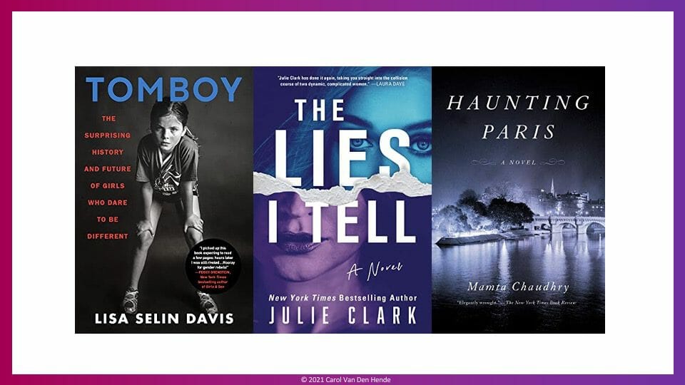
3. Clean, bold images and fonts. For several years, book covers have been trending towards “clean,” bold looks that can be easily registered at a glance. This is especially useful in bookstores with many titles or in a digital environment, when the cover needs to break through as a small thumbnail image. This works particularly well when paired with more contemporary sans serif fonts, that don’t have the extra details, and therefore aid readability.
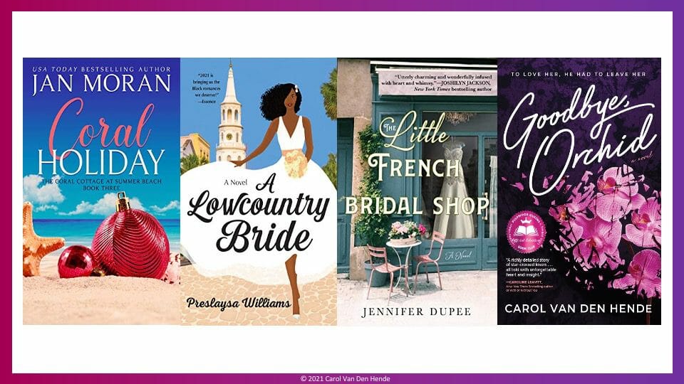
4. Unique script fonts. The use of handwritten or cursive fonts can add dynamism and memorability to a cover design. Here are some great Novel Network examples that retain legibility of the title while imparting a feeling of visual movement:
5. Bygone era. An important job of a cover design is to convey to a reader what to expect inside the book. For instance, you can often tell the difference between contemporary and historical novel at a glance. Below are relevant examples of this. The combination of images and clothing from a different era, and in some cases, an old-timey font, cue that these stories are set in a historical time.

6. Evoking feeling via color washes. We won’t go into color theory here. However, we’ve probably all personally experienced certain hues evoking powerful feelings. (Note that colors can have different connotations in different cultures or countries. The observations stated here have a US skew.)
For now, let’s look at two examples. Have you noticed how blues can be cool, calm, relaxing, or immersive?
Greens are known to convey growth, stability, endurance, good luck, generosity, hope, health, vigor, safety, and renewal.3 Take a look at these examples:

Review the groups of covers we’ve discussed. Did the varying styles draw out different emotions in you?
I hope you’ve enjoyed this look through some book cover themes, including 1) obscuring the protagonist’s features, 2) realistic photography, 3) clean bold images, 4) script fonts, 5) bygone era, and 6) color washes.
Remember, none of these book cover trends are “right” or “wrong.” Book cover assessment is about the fit of the cover to convey the book’s promise, and as with all art, is highly subjective!
This is a topic I adore, so feel free to connect with me to share your observations. Please check out the great titles and all the talented authors at https://NovelNetwork.com.
1 University of Rochester https://www.rochester.edu/pr/Review/V74N4/0402_brainscience.html
2 Shutterstock https://www.shutterstock.com/blog/science-behind-book-jackets
3 https://www.colorsexplained.com/color-green-meaning-of-the-color-green/
ABOUT THE AUTHOR:
Carol Van Den Hende is an award-winning author who pens stories of resilience and hope. Her novel Goodbye, Orchid is inspired by combat-wounded veterans and won the 2020 American Fiction Award for urban fiction, IAN Outstanding Fiction Award for Best First Novel, Audiobook Reviewer Award for New Author of the Year, a Royal Dragonfly for disability awareness, and a dozen other recognitions.
Buzzfeed, Parade, and Travel+Leisure named “heartwarming, heartbreaking” Goodbye, Orchid a most anticipated read. Glamour Magazine recommends this “modern, important take on the power of love.” The world’s largest book club, The International Pulpwood Queens, selected Goodbye, Orchid as a 2022 Book-of-the-Month.
Carol is available to visit with book clubs via NovelNetwork.com.